
DANIEL PINO

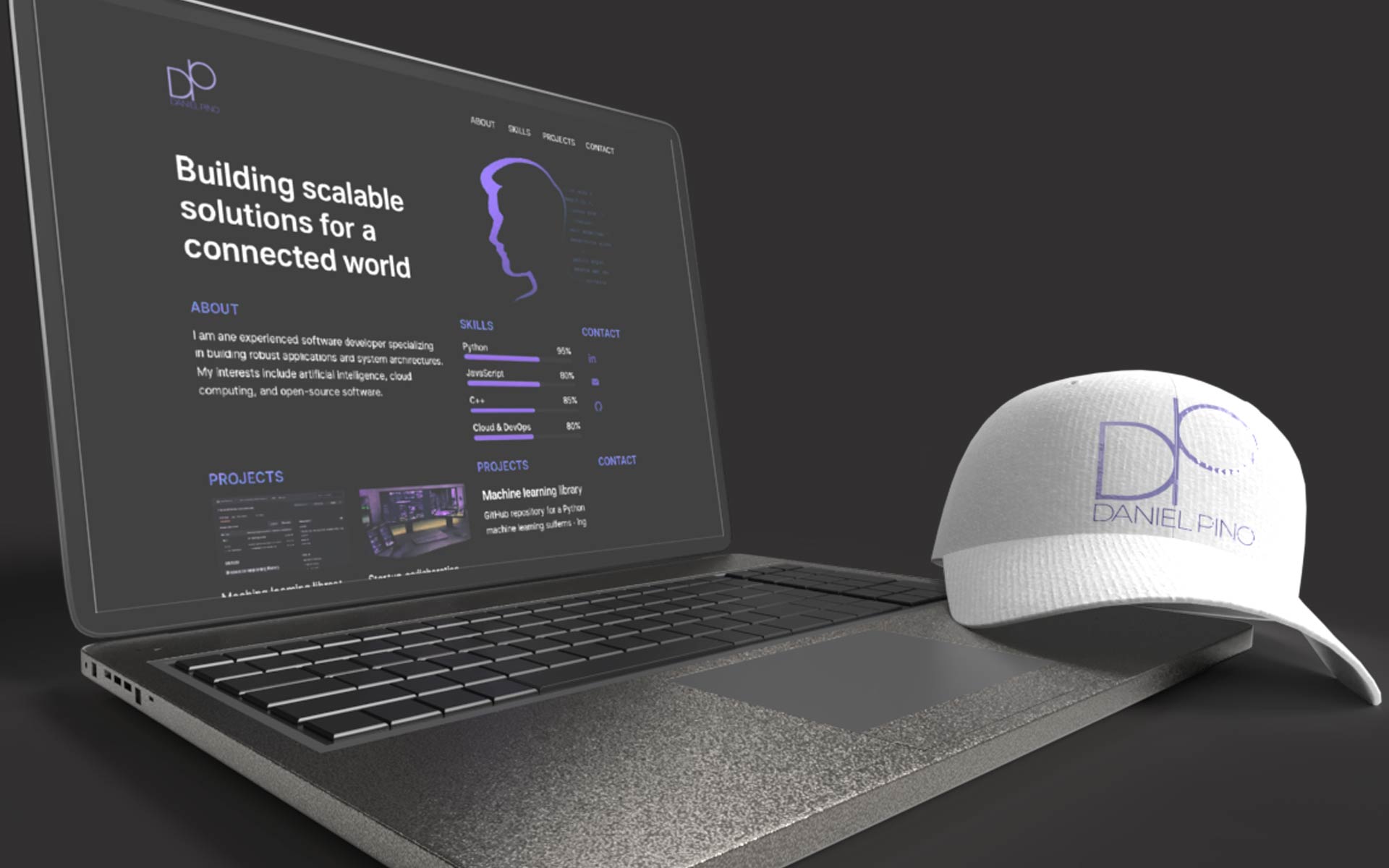
The brand identity for Daniel Pino was developed as a balance between precision, clarity, and forward-thinking structure—core principles that define his work as a software architect based in Barcelona. The visual system translates complex technical thinking into a refined and minimal language, where geometry and proportion play a central role.
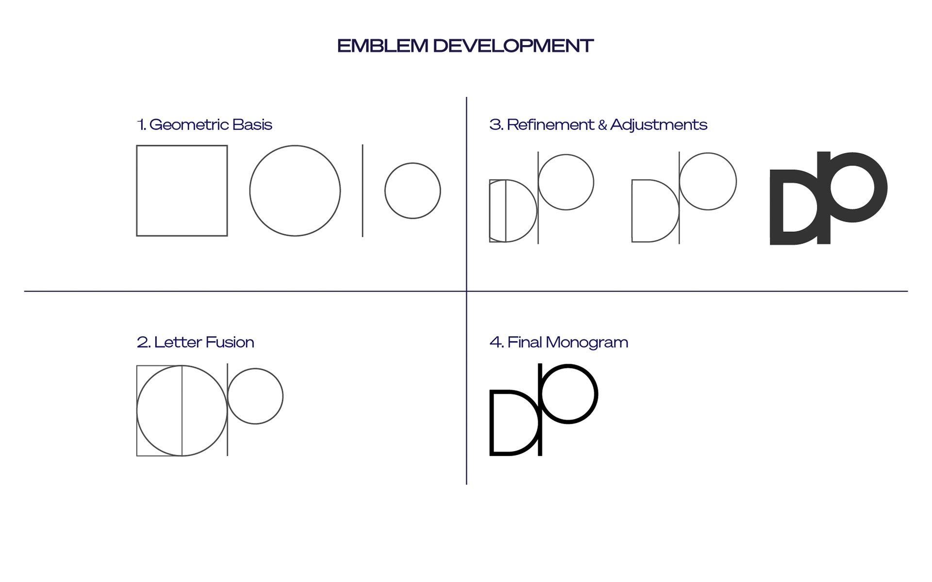
At the heart of the identity is a custom monogram that merges the initials “D” and “P” into a continuous, architectural form. Its construction reflects logic, scalability, and structural coherence—qualities inherent to both software systems and modern design. The bold circular element introduces contrast and visual tension, symbolizing expansion, iteration, and the evolving nature of technology.
Typography was carefully selected and refined to maintain balance between neutrality and personality, ensuring clarity across both technical and brand communication. Every detail—from spacing to proportion—was adjusted to achieve a cohesive and timeless result.
In addition to the logo design, a complete brand guideline system was developed, establishing a consistent visual framework aligned with Daniel’s current positioning and future projects. The identity is built to scale across digital environments, supporting long-term growth while maintaining a strong and recognizable presence.